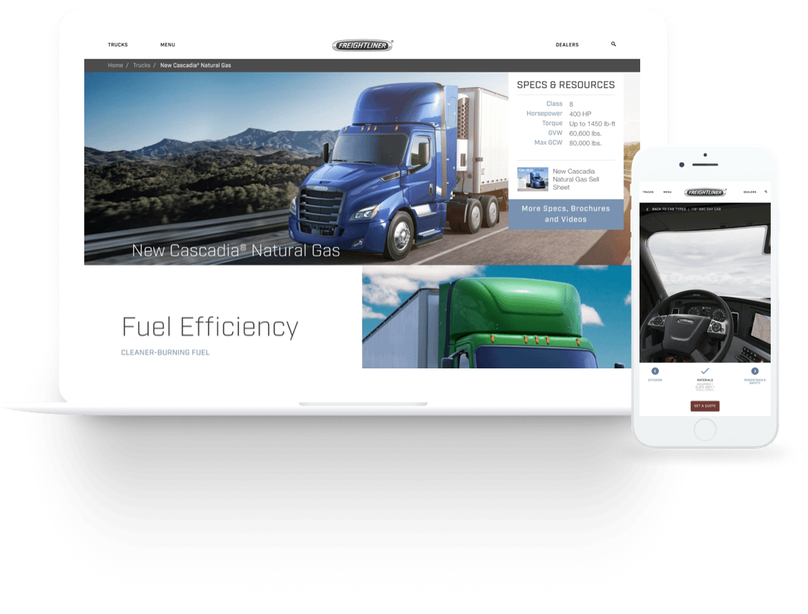
Freightliner Trucks is one of the leading brands of heavy-duty trucks in North America. They remain dedicated to producing trucks engineered with business owners and professional truck drivers in mind. They build and offer trucks designed to deliver results that build businesses and grow bottom lines.
In late 2017, executives of Freightliner Trucks assigned to 7strategy the responsibility of doing the re-design of their website. As Lead UX Designer for the agency, I took care of managing and executing the entire process. Even though I did not have the chance to interview with upper management, my direct point of contact was their Digital Marketing Director, who was the main source of information for both, industry and market insights during the first part of the process. I had Daily Interviews with him via phone calls during a period of two weeks in which we worked on establishing the main goals for the redesign project.
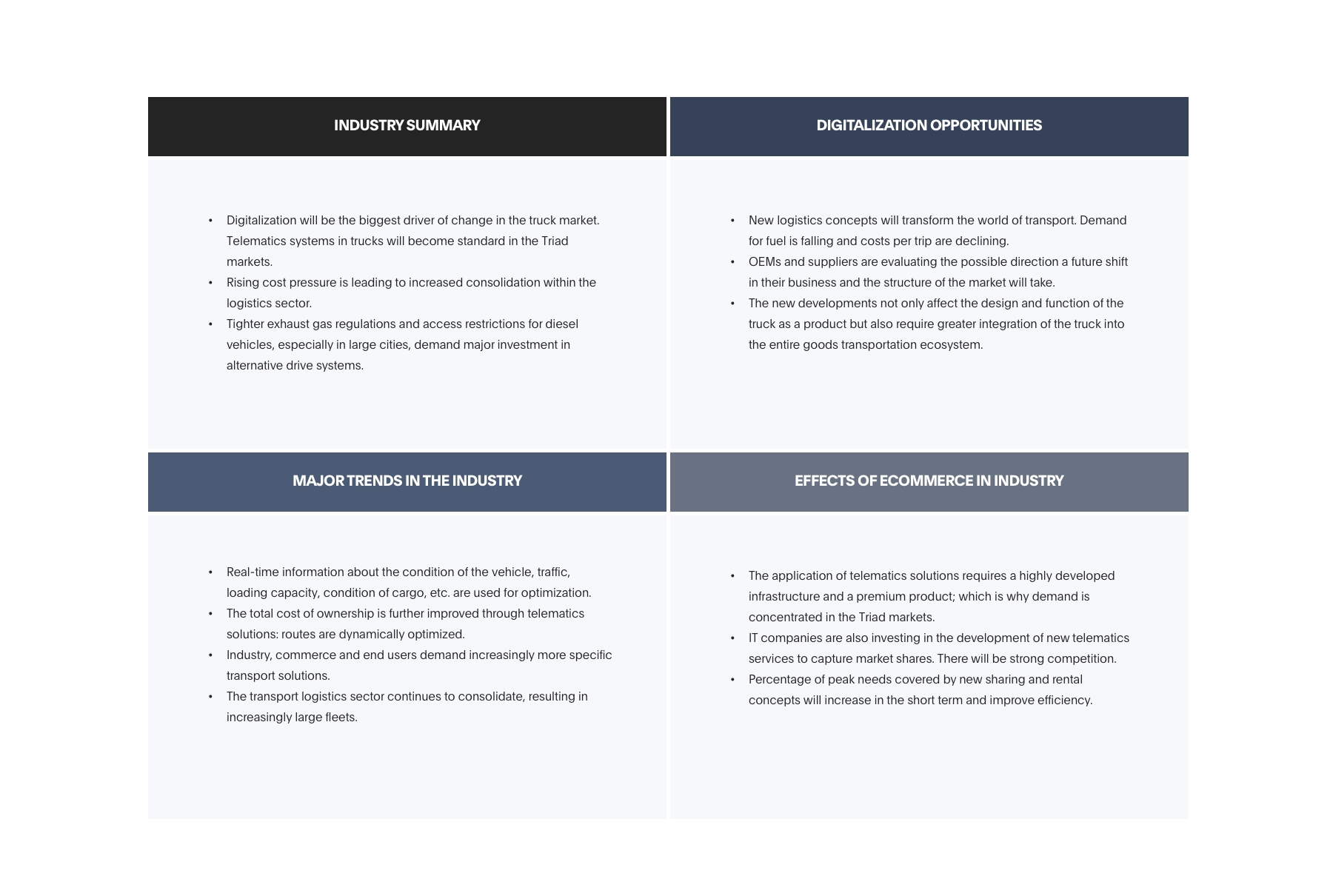
To start off, I researched general information about the e-commerce trucking industry and noted the common trends and pain points of online trucking websites. This secondary data along with information collected from the client, helped me gain perspective about the subject matter and potential needs of potential customers.
Even though at the time, there were many trucking company websites, only a few percentages of them where really deploying an online strategy for generating revenue and none of them were advertising properly the technological advantages of their products (which is one of Freightliner Trucks’ strengths). This is why I did a Competitive Analysis of direct and indirect competitors by their strengths and weaknesses. This allowed me to better understand customer expectations and how Freightliner Trucks can position themselves against competing companies.
In order to build a better understanding the dynamics of e-commerce in the Trucking industry and determine whether users were fulfilling their goals through the current website or not, I conducted 4 User Interviews with customers who contacted Freightliner dealerships using the site in the last 6 months. These interviews consisted of one-hour video calls in which I asked them open-ended questions related to their experience using the website and the overall sales process with the company. Additionally, I observed them as they were browsing through the website and asked them to complete 2 specific tasks (Find a truck model and find a dealership) while I captured their interactions with Hotjar.
Some key findings:
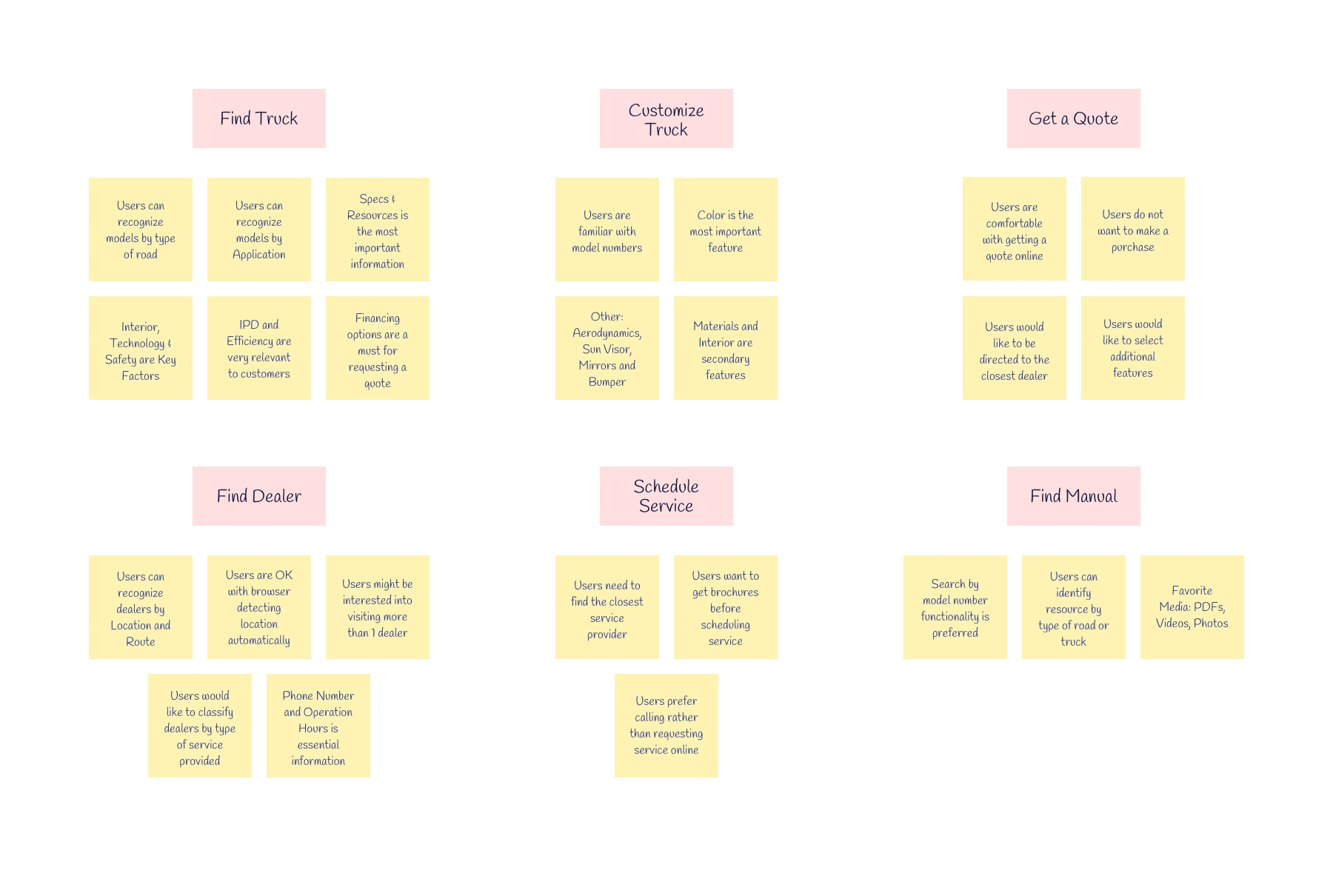
From the information previously collected during the users’ interviews, I was able to identify specific tasks that current users were looking to complete and couldn’t do through the website:
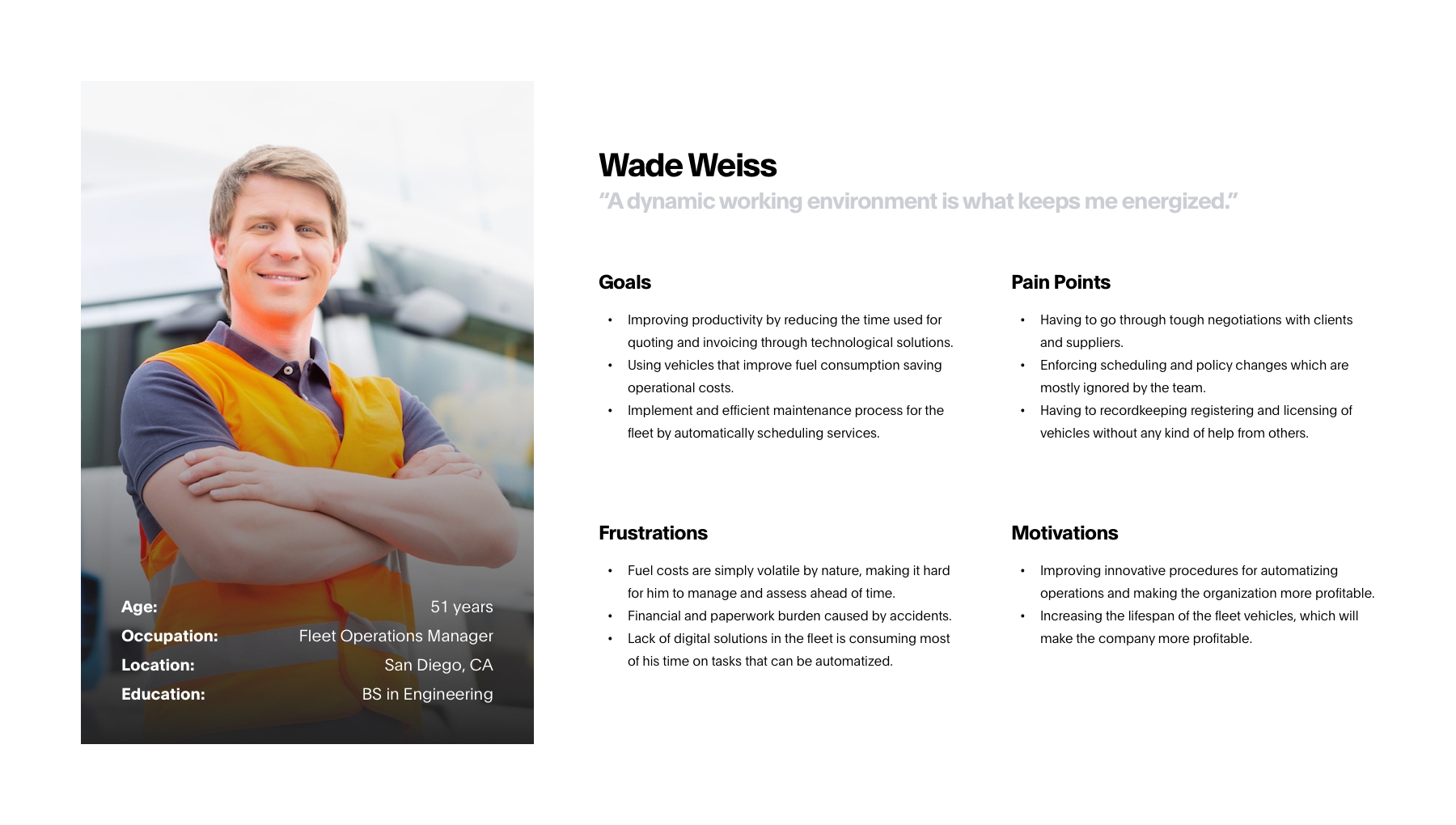
The next step consisted in developing User Personas that could help me communicate to the stakeholders my vision of what type of users are part of the target market in order to get their confirmation on the information presented. After two rounds of revisions, we were able to agree on the final three Personas: Owner Operator, Truck Fleet Manager and Truck Driver.
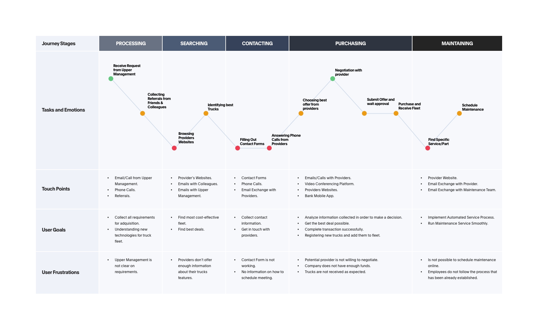
From the analysis facilitated by user personas, it was obvious to identify that users were not having a satisfactory experience with the current site. For this reason, I created Journey Maps for each one of these personas with the purpose of visualizing the optimal experience for each type of potential customer. Understanding and empathizing with customers lays the groundwork for meaningful interactions and successful business outcomes.
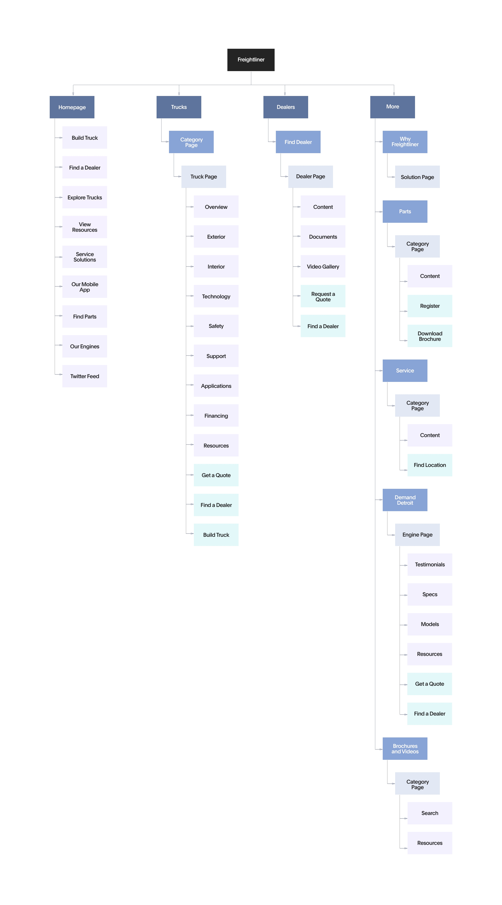
To rebuild the website’s information architecture I organized a remote Participatory Design session with some employees and various categories of users (3 participants totally). We started with laying out the website’s content elements on sticky notes, then sorted them into categories, and finally organized by pages, keeping in mind specific use cases. To receive additional feedback, I displayed the board to the Digital Marketing Director, which allowed me to make several significant improvements.
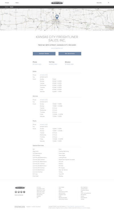
Once I had written and visual information that allowed me to understand Users/Stakeholders goals much better, I started with the brainstorming process for coming up with potential visual interfaces for the new web platform. My approach consisted of creating Sketches for the two main tasks (Find a Truck, Find a Dealer) defined during previous steps. I presented these sketches to the client in two different video sessions, one for explaining my rationale behind the design decisions and another one for testing the paper prototypes with the client. Feedback provided by them was really helpful for refining the sketches and making changes before moving on to the next step.
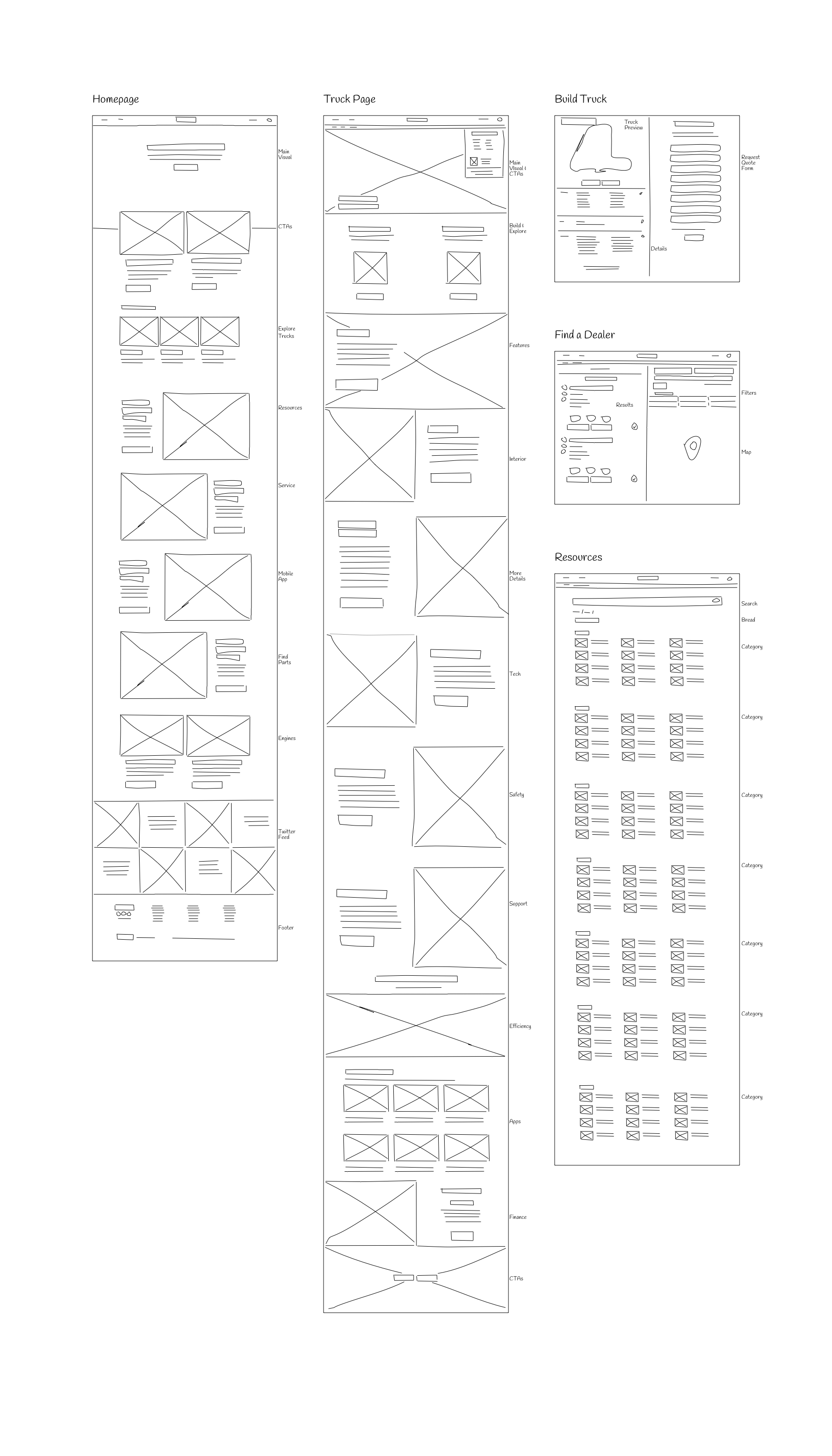
Tempting as it may be, jumping straight into an interactive prototype is a bad idea. wireframes are the best way to test ideas and fail forward with the minimum of effort. By having this in mind, I created Wireframes for all 6 main tasks with the purpose of showing them to users who could provide feedback on them. I arranged a group video call with 2 participants who were part of the interviewing process who agreed to test the wireframes. For this purpose, I used InVision for creating and sharing the wireframes with them and asked them to add comments and annotations if needed. After analyzing feedback and applying corresponding changes, I presented the updated wireframes to the stakeholders for them to give their approval.
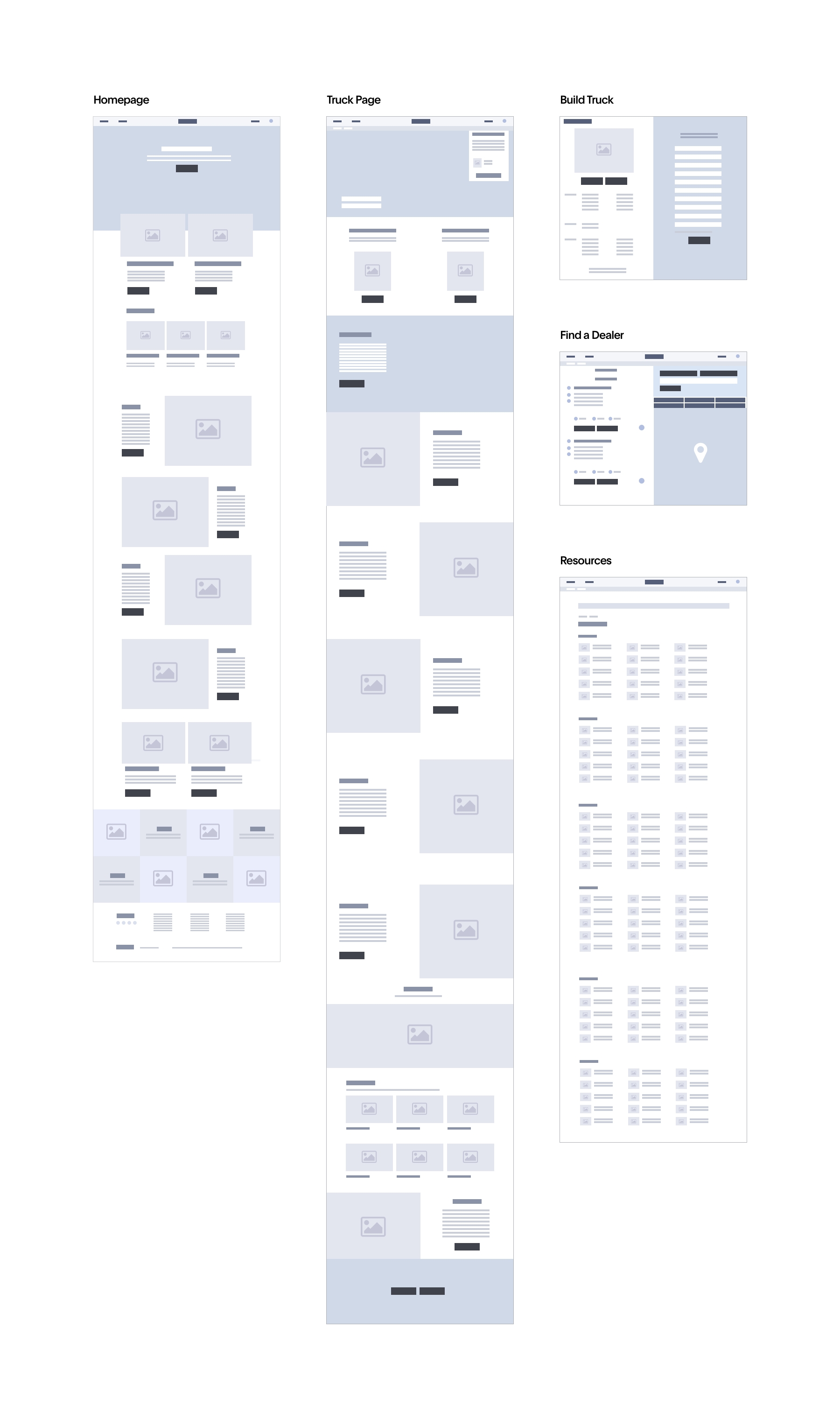
Once wireframes were approved, I then moved on to producing High-Fidelity Interfaces for the new solution. The client gave me the freedom of using my own judgment for the visual aspect of the UI, with the only condition of using the already established and well-known logotype. Since the look and feel was one of the main reasons why users disliked the previous website, I decided to do something that stepped away from that visual presentation and work on something that was cleaner and looked more modern.
Blue and white are the most prevalent colors, mostly because I was looking to send a message of dependability and trustiness to the visitor, which are important values for potential customers when they are looking to renew their truck fleet. I used AdobeXD for producing 18 interfaces of all the main sections of the website. The goal of doing this was to evaluate a more faithful version of the new solution, which would include rich interactions so evaluators can get a better understanding of my vision for the future platform.

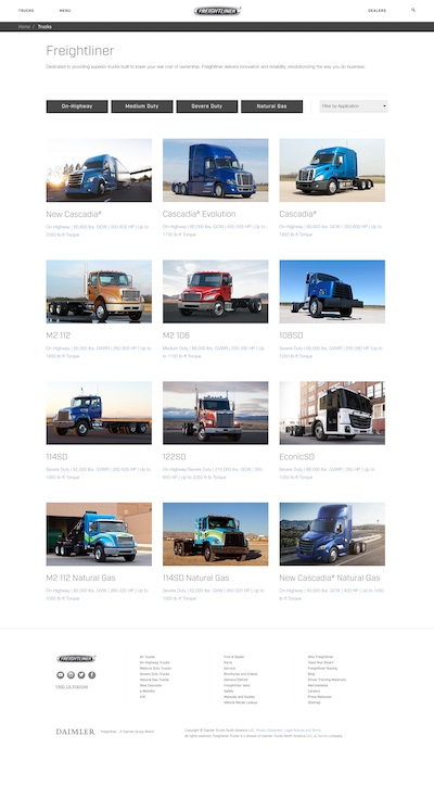

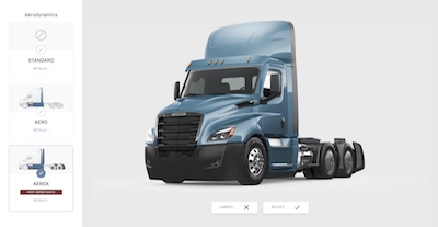
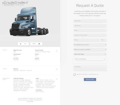
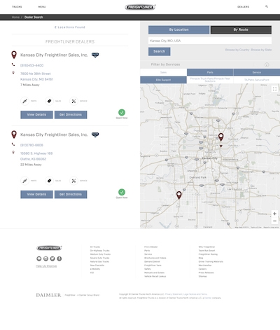

Once the high-fidelity interfaces were ready, it was time to get feedback from users through Usability Evaluation. I recruited 2 participants and scheduled 1-hour sessions in which I gave users specific tasks to complete while I was recording their interactions with HotJar. In all cases, users were able to complete tasks in a time considerably lower than what they spent on the previous website. At the end of each session, I had a debriefing interview with participants in order to get qualitative information on their perception of the look and feel of the prototype. Information revealed that only a few tweaks were needed, especially for the “Build Truck” functionality.
Once the high-fidelity prototype was tested by users and approved by stakeholders, I could move on to the build-out phase. I started with the programming of the Front-End (HTML, CSS, Javascript) and progressively shared interfaces to the Digital Marketing Director, so he could interact with them. The most challenging part was the development of the “Build a Truck” feature, which required the collaboration of Freightliner IT specialists who provided me with a full database of models, colors, and accessories for me to test the pages as I built them. After four weeks of working on the Front-End, I moved onto the Back-End (WordPress) installation and configuration. This process took about two weeks since it required to import information from their current website along with a large database of registered dealerships.
New information architecture along with better programming practices allowed to boost the website's SEO.
Improved SEO and mobile platform allowed to get new visits which generated new leads for the company.
Right before launching the new website, we integrated different plugins for improving the site speed and customizing metatags for each page of the site. The goal for this was to support a potential SEO campaign for driving more organic traffic to the new platform. After monitoring the website performance with Google Analytics for three months, we were able to confirm that the redesign helped to improve the website’s ranking on Google, which drove a considerable amount of new visitors to the website. Crawlers were able to index pages more efficiently since the content provided was better structured and a mobile version of the site was developed. More traffic leads to more sales since now it is easier for users to find specific models, get information about their specs and get in touch immediately with the online tools that the new website provides them.