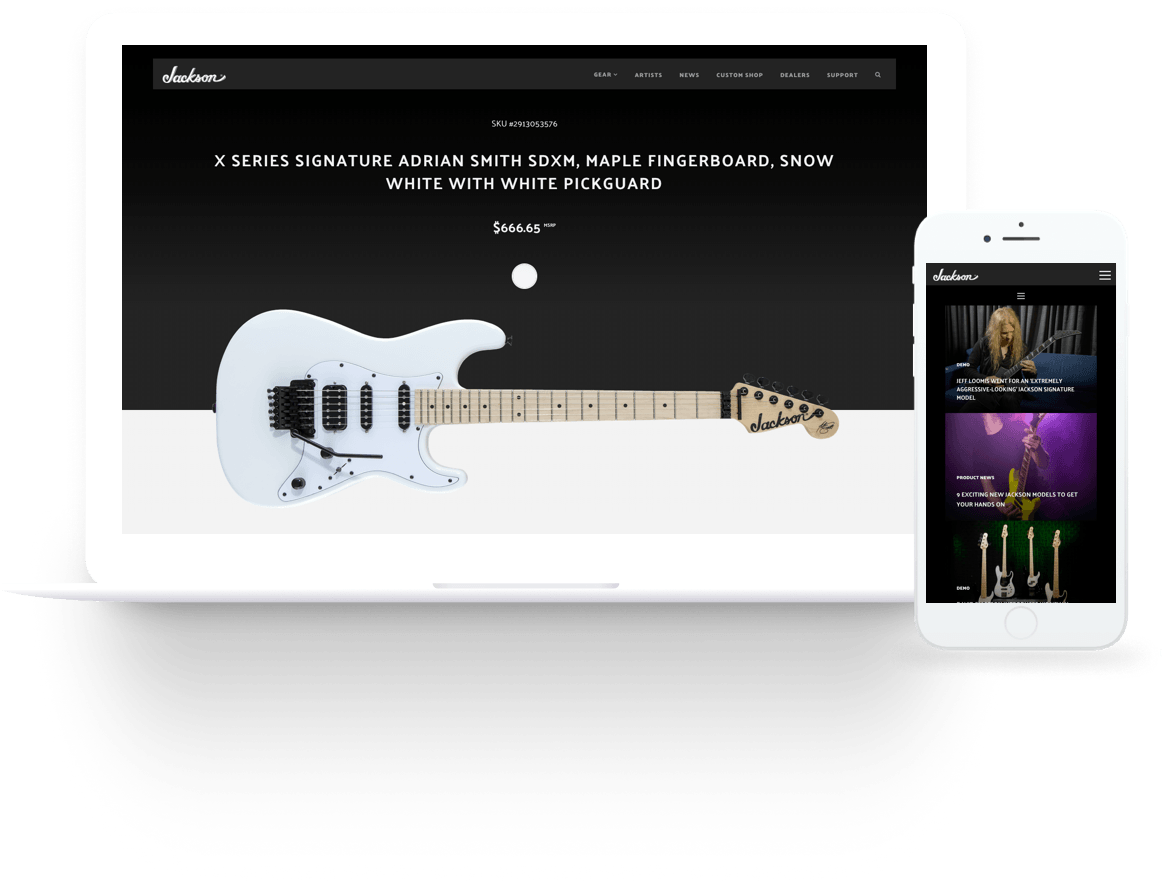
The Jackson bloodline began back in the late 1970s, when heavy music experienced a flamboyant and virtuosic resurgence in popularity and a small Southern California guitar repair shop became the epicenter of a new level of shred-approved excellence. Ever since then, Jackson guitars have been universally lauded as the metal guitars; the shred machines, highly-original, high-performance instruments of distinctive style and formidable substance. From metals chart-topping peaks to its darkest recesses, for discerning guitarists all over the globe, Jackson is the only way to go.
As Lead UX Designer for 7strategy, I was assigned with the task of creating a new website for the brand. From my initial Phone Interviews with Jackson’s Operations Coordinator, we agreed that the site needed to reinforce their core business values: cutting-edge, highly-original, and high-performance. The site also needed to distinguish the brand from other e-commerce retailers by emphasizing their highly curated inventory of hand-picked specialty items. From a round of Interviews with 3 different directors, I was able to identify the following business goals for the new website:
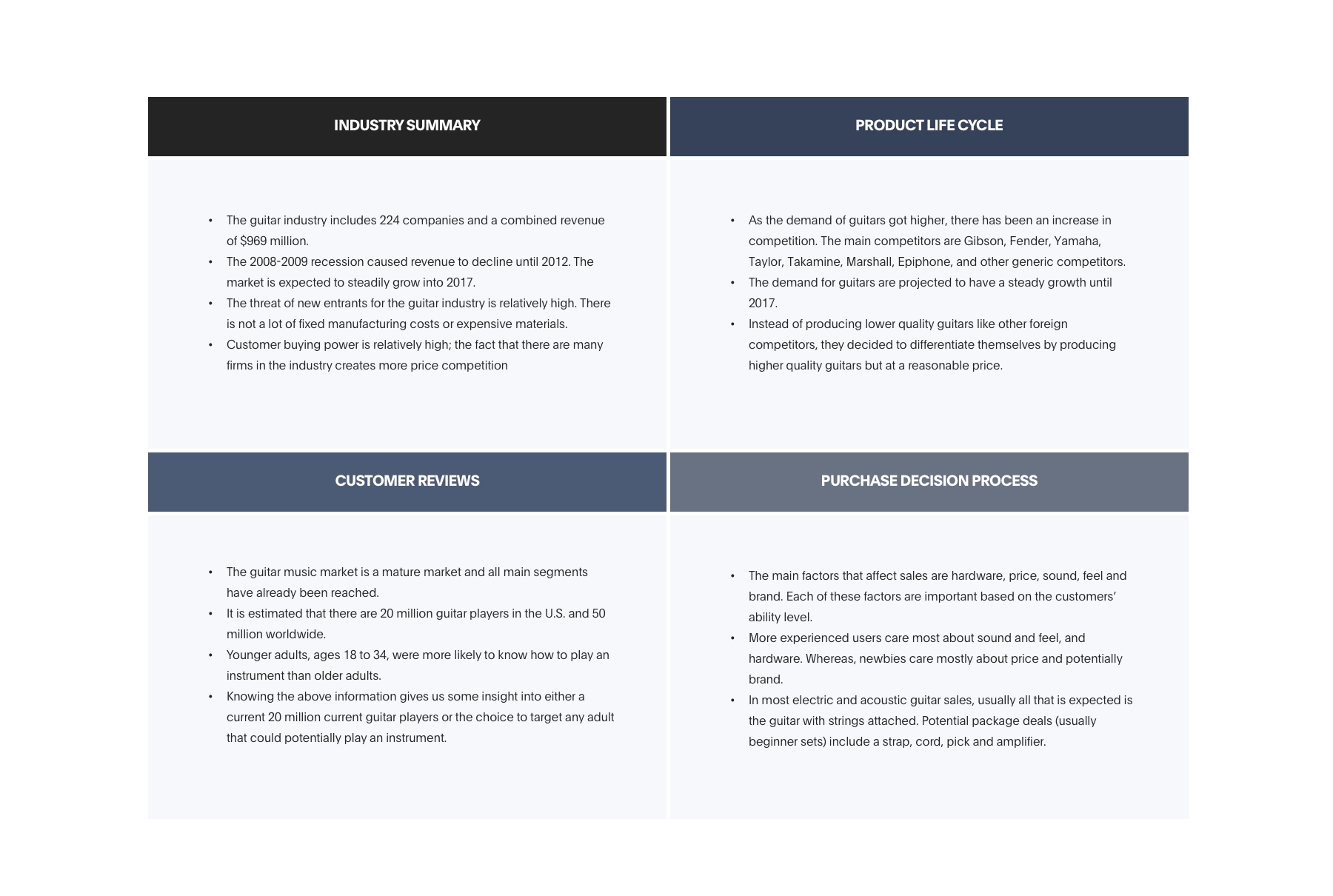
Now that stakeholders’ main goals have been established, it was a good moment to start analyzing problems Jackson Guitars was having with their current site and why it was not producing the desired results.
For this reason, I did a Competitive Analysis, comparing other guitar makers’ websites with Jacksons’ looking for patterns and possible explanations of what was causing the current site to do not fulfill their business goals. My findings showed that current Information Architecture was oversimplified, making it difficult for visitors to find the specific models they were looking for since current categories did not match visitors’ mental models.
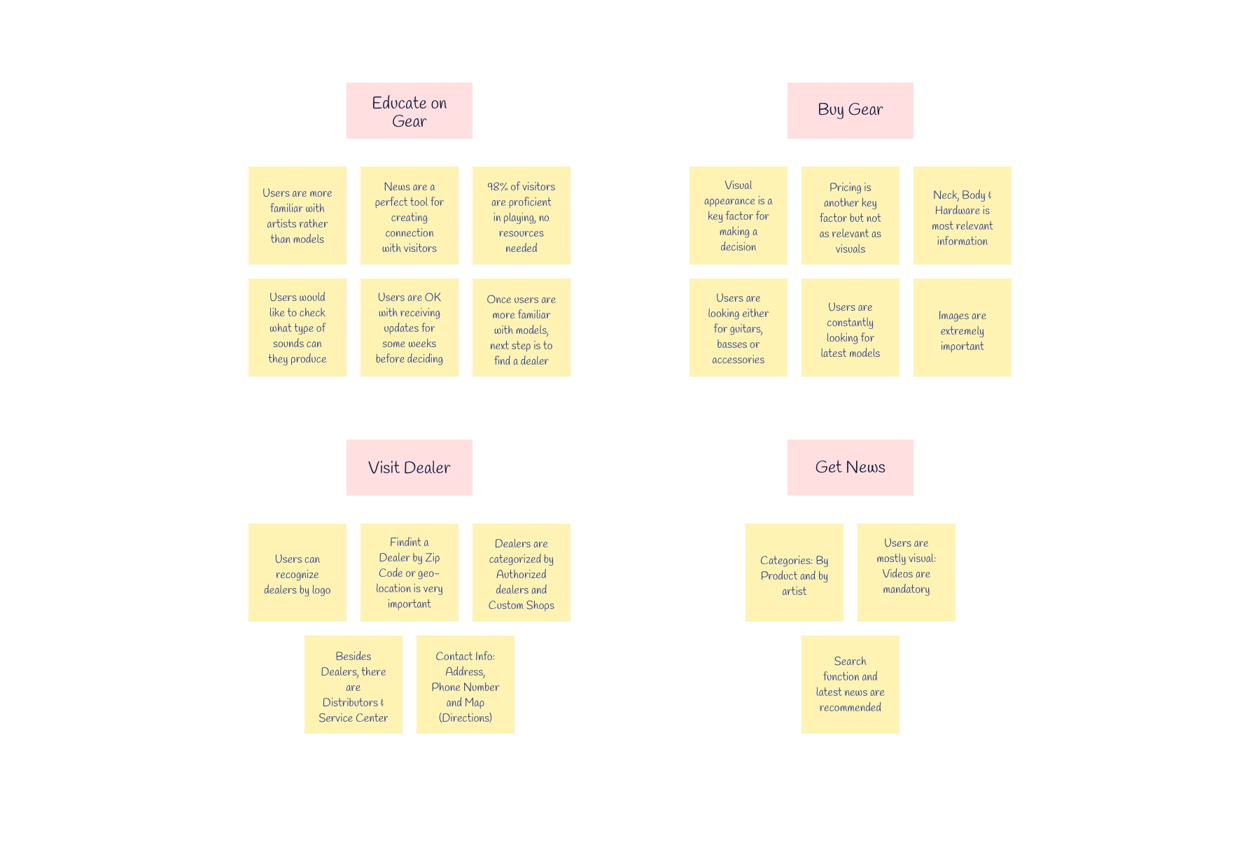
Due to the nature of the problem space, I relied heavily on primary research to speak with past users of all levels, from those that were just starting out to those that have spent an extensive amount of time honing their craft. The type of questions I asked where surrounding musicians current or previous experiences with the website and other similar websites. I conducted 10 User Interviews over Google Hangout. Through this I learned the following about User Expectations with the redesign:
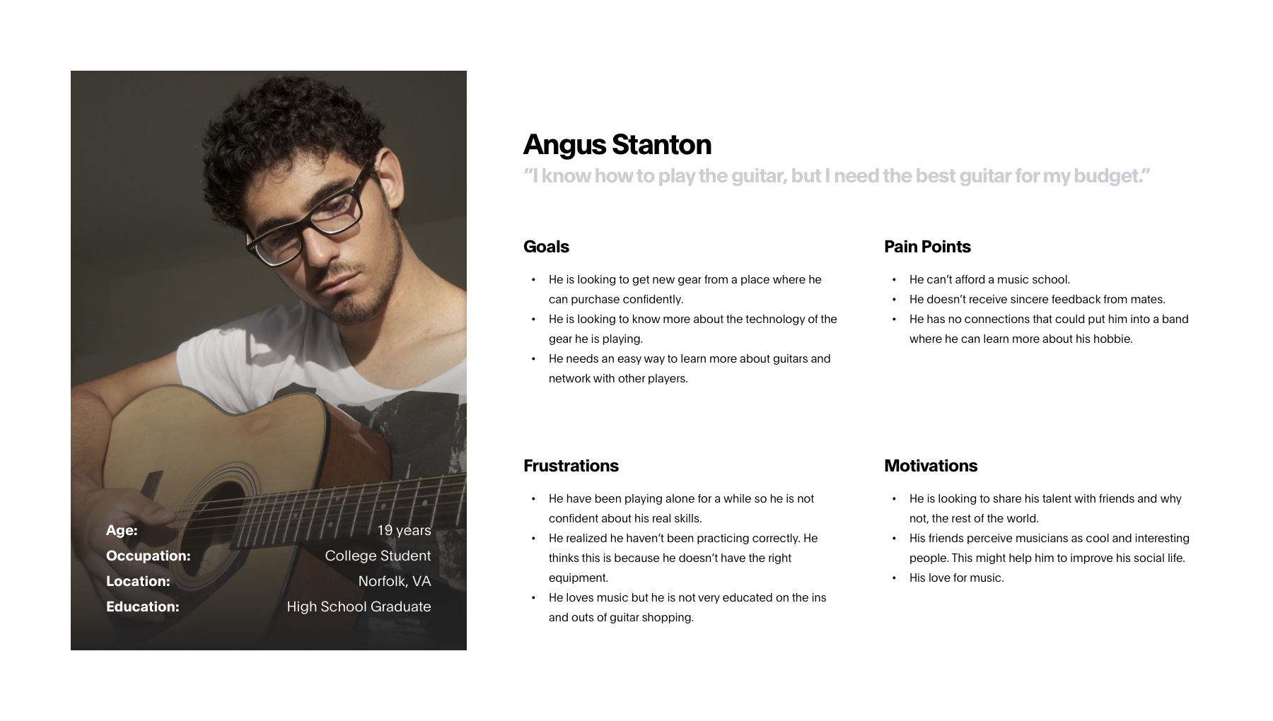
Who are we really designing this website for? During the first phase of the process, I was able to identify 3 User Personas, each with specific needs and pain points: Apprentice, Intermediate and Expert. Based on the three user personas, I identified the main user needs I wanted to address in the website while also taking into consideration the needs of Jackson Guitars.
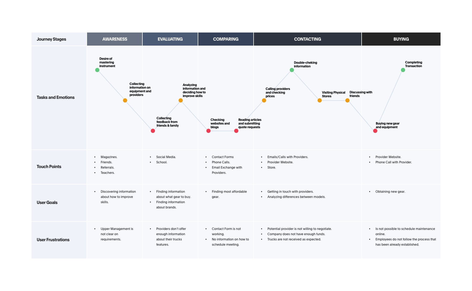
As part of this research, right after user personas were defined, I created User Journeys for each persona, with the objective of having a visual tool that could communicate my vision of users behavior when completing tasks. By leveraging user journeys as a supporting component of an experience strategy it’s possible to keep users at the heart of all design decisions made during the process.
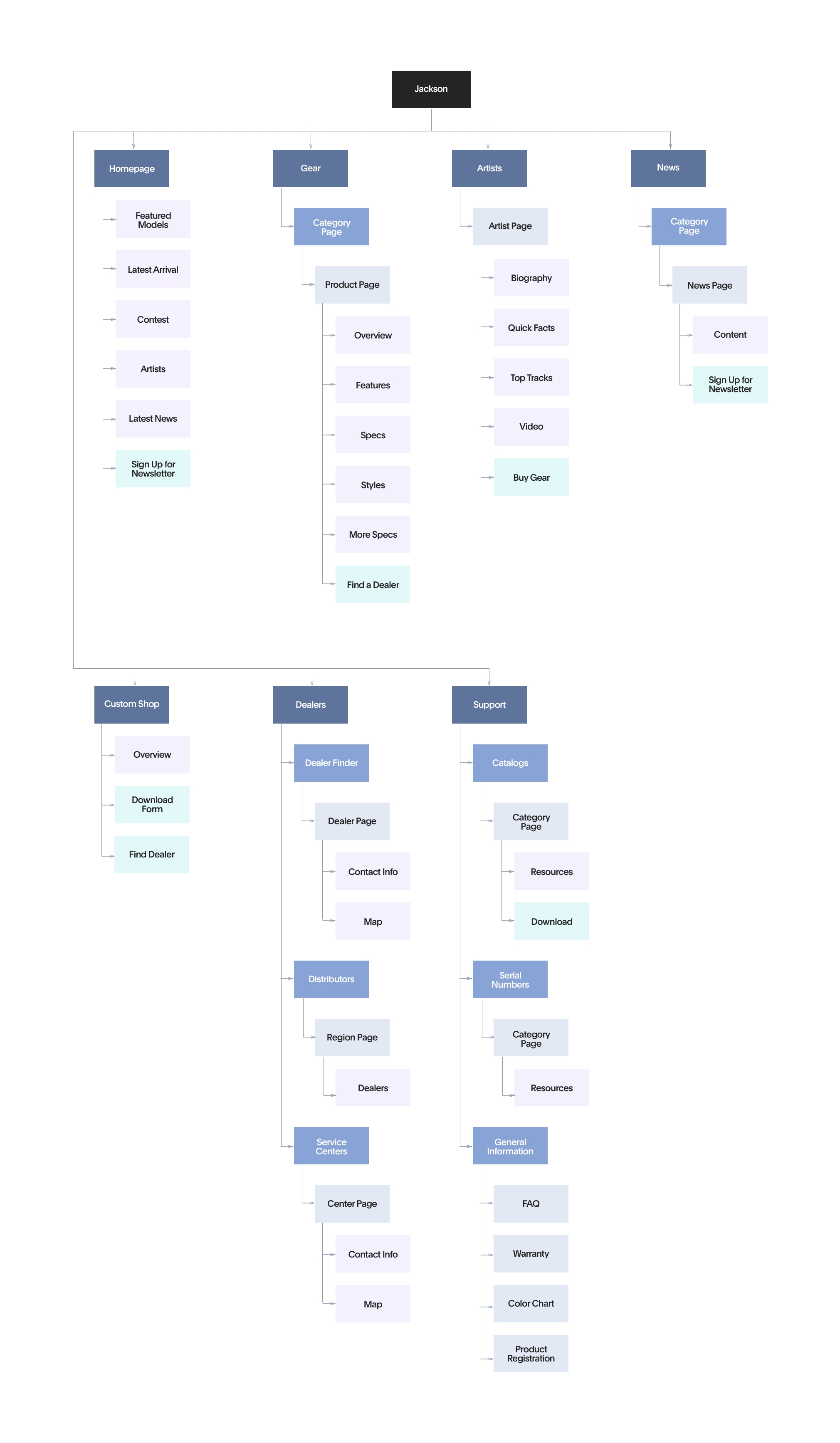
The next step of my process was to develop the navigation system by conducting a Card Sorting exercise, a user research technique to tap into people’s existing mental models. For this project, I was given an inventory of 28 of the store’s best-selling models to use as a guide. With such a large inventory, it was essential to organize this information in a clear and understandable way so that site visitors could find the products they’re looking for.
With the results of the card sort and inspiration from other competitor websites, I created a Sitemap to define the overall structure of the website. This was to ensure that products were going to be placed where users would expect to find them when visiting the website and make the experience more intuitive.
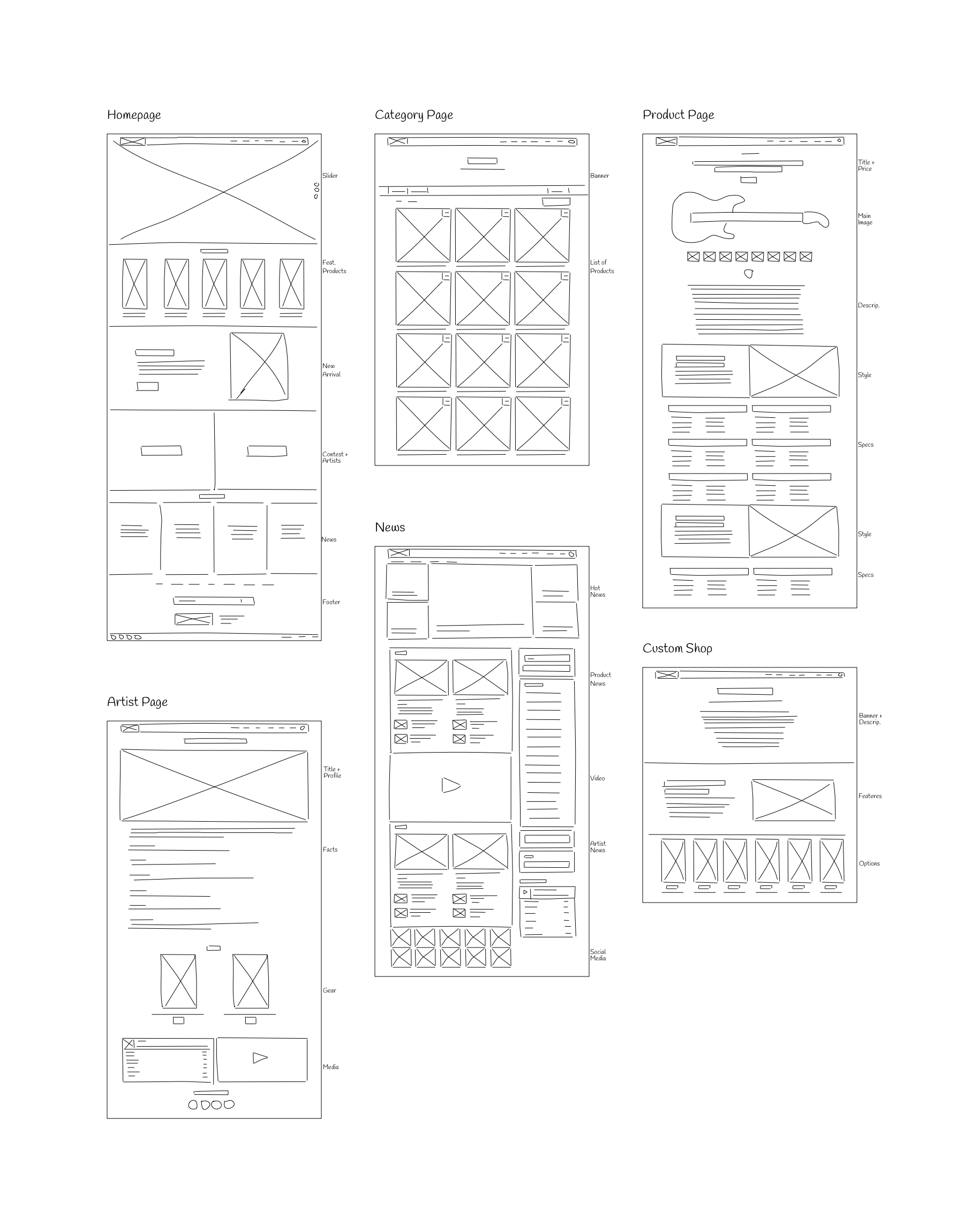
Once I organized all my insights from the research phase into formal documents, I began to design the website. To start this process I began to Sketch several of the site’s main screens, using the sitemap and journey maps as a guide. This allowed me to quickly explore several concepts for the website layout. I presented these concepts to Jackson Guitars’ operations coordinator looking for feedback or recommendations.
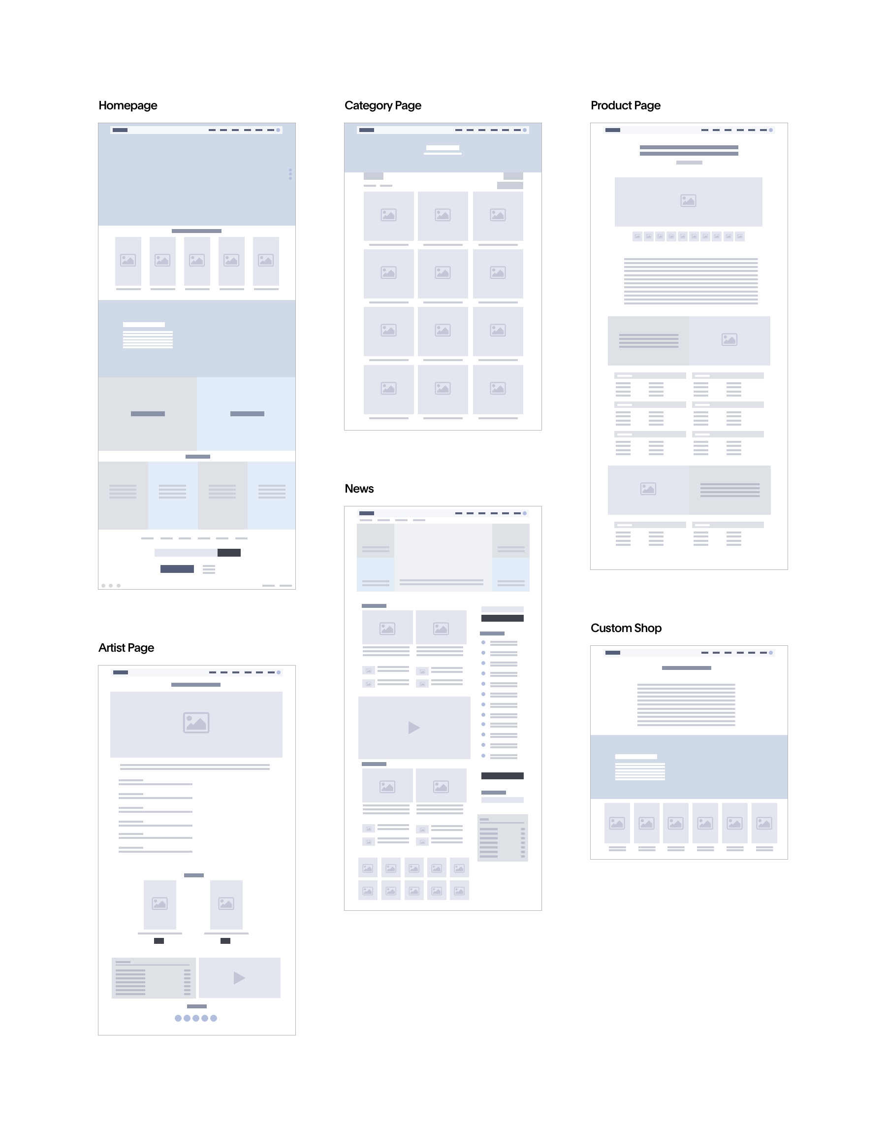
Based on the feedback and personal insights I learned from the sketching phase, I began to design my first Wireframes using InVision. I made sure to prioritize the features that would best address the needs of the users throughout the website. Moreover, the simplicity of wireframes allowed me to quickly test ideas with 3 participants without going deep into the visual details. Feedback provided by users was valuable for refining the concept before moving onto a higher fidelity.
After the wireframing was done, it came the time to give more life and color to the concepts. In order to follow Jackson Guitars branding guideline, I looked for references with dark and elegant color palettes. To get the attention of the desired target audience — novice and expert guitar players — I chose to use black and a mixture of gradients and solid patterns with two sans-serif typographies with lots of power and personality. After completing all the previous steps, the time has come to shape the final prototype through the construction of 15 digital interfaces which were put together as a functional High-Fidelity Prototype using Adobe XD.
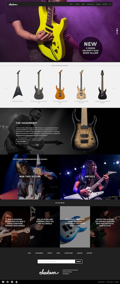
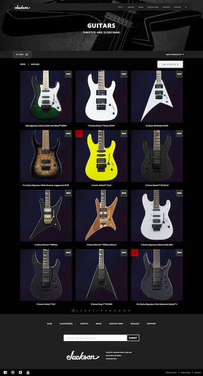
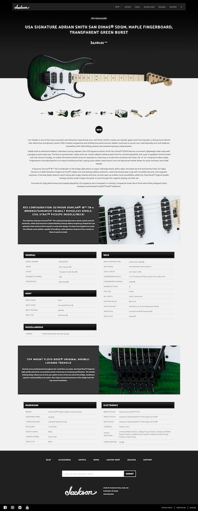
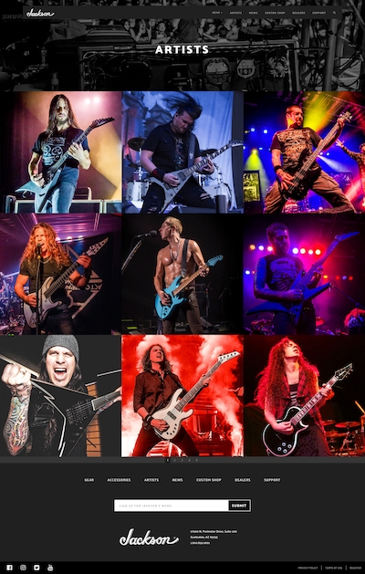
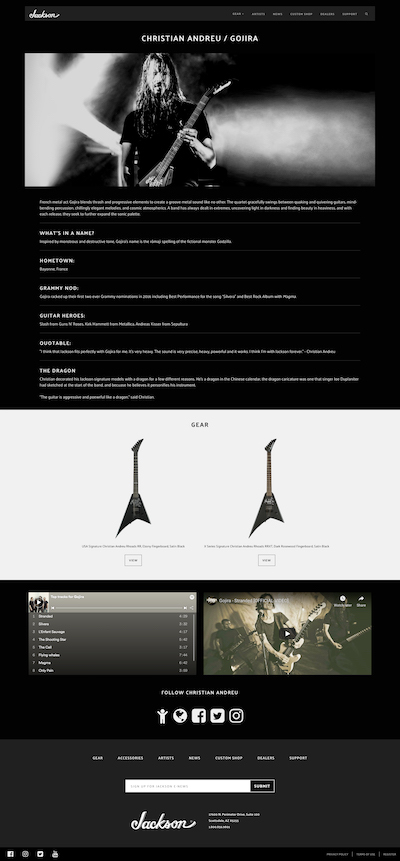
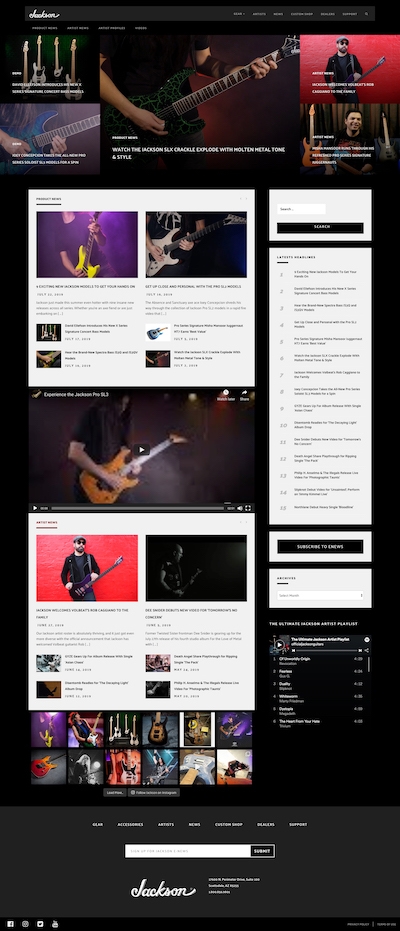
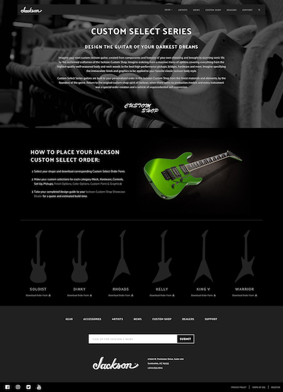
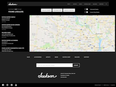
Once the prototype was ready, I began Usability Testing, so I could evaluate how users would engage with the proposed website solution and validate whether it was addressing the primary user needs. I conducted a usability test with 4 participants and asked them to complete three different scenarios to put themselves into the shoes of my user personas. My key findings from the tests were:
In general, feedback received was positive, it only required some minor changes for addressing the major concerns brought up by users. After doing so, the Usability Report was presented to Jackson Guitars’ stakeholders, who approved it immediately.
The built-out of the new website started with a fresh installation of the latest version of WordPress and configuration of WooCommerce for adding e-commerce capabilities to the site. Next step consisted of migrating all the information from the current website into the new platform. Back-end was fully customized so fields and information defined in previous phases were reflected in the final solution. Once the site was fully populated, I started working on the Front-End, using Bootstrap for quickly building the HTML, CSS, and Javascript.
My user-oriented approach helped to increase the number of leads by showing clearer call to actions and user paths.
Average time spent on the website increased considerably, as well as the number of pages viewed by each session.
One of the most daunting, yet rewarding, task to take on is that of relaunching an e-commerce site. In the first six months, I kept track of different metrics using Google Analytics and Hotjar. Aligning focus on specific data metrics is the only chance at extrapolating the relevant information necessary to make adjustments regarding the already established strategy. Launching a new e-commerce site can be overwhelming; especially from a data standpoint, but by focusing my efforts on some key metrics I got a good idea of what was working and what wasn’t. Minor changes to the site have been done periodically since its re-launch, all based on information that helped to improve conversion and overall user satisfaction.